Overview
Three principles define a useful Astro Notification:
- Timely - The right notifications are displayed to the user at the right time.
- Relevant - Communications through notifications are related to the user’s primary tasks and goals.
- Actionable - The information in a notification helps the user complete their current task more effectively, or clearly re-directs the user to another task.
Notifications vs Interface Feedback
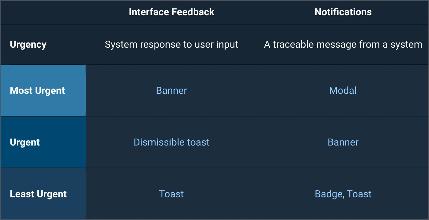
Notifications and interface feedback both communicate important information to the user and use different patterns, but they can be distinguished by their traceability.
- Notifications are traceable, meaning they can be viewed later on in a log. Dismissed notifications will show up in a log, but dismissed interface feedback will not.
- Interface feedback is not traceable and occurs in response to user input such as when a user receives a notification that there was a problem uploading a file or an invalid input in a form field.
Choosing a Pattern for Notifications
When choosing a pattern for notifications, you must first choose which type best fits the message content. As it has been defined, notifications will be communications with the user that hold information which needs to be accessed later. This information may or may not require a response and will have different levels of urgency.
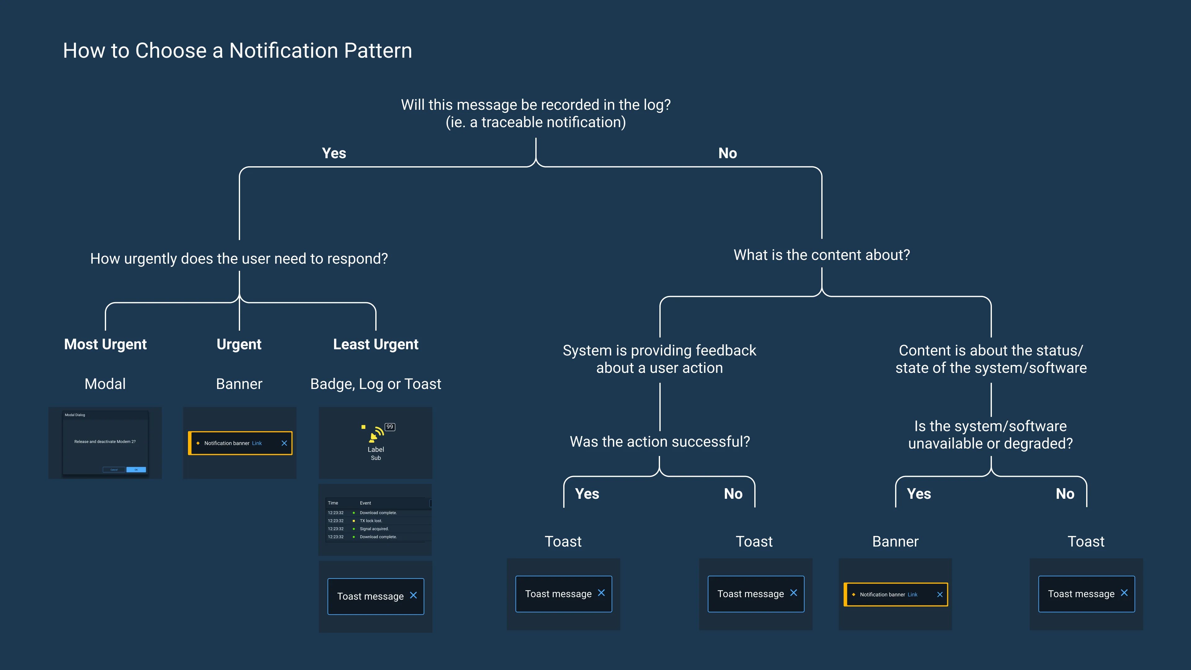
Below is a graphic to help choose which pattern to use depending on whether the message being displayed is a notification or interface feedback (form validation guidance can be found on the Forms and Validation page).
Understanding Context for Notifications
It is important to understand the impact on, and context of, the user and their role before choosing a notification pattern to deliver a message.
For example, if an operator is monitoring a mission-critical satellite and sees a disruption in the satellite’s signal, this would be relevant to their primary task of monitoring specific satellites for anomalies. As the satellite is deemed mission-critical, it would follow that the urgency level of this notification would likely be high.
This notification would require the operator to restore the signal, changing their task from monitoring to troubleshooting. An application designer should use a modal or banner to display the notification as the message is important enough to grab the user’s attention and require that they respond to the notification immediately.
However, if the operator is likely to be monitoring multiple satellites, a modal might be too disruptive to their primary task and a banner would be more appropriate.
Considering the context and how the notification pattern will impact the user and their ability to complete their primary tasks will help mitigate potential issues.
Limiting Intrusions
When interface feedback or less urgent messages are treated as important notifications, the interruption only distracts the user and hinders their ability to successfully complete their tasks.
Some examples of intrusions are:
- System updates
- Feedback informing the user when a document has been auto-saved
- Toast confirmations of a completed action
These messages should use patterns that cause the least disruption.
When attention-grabbing notification patterns like banners are overused, they clutter the interface, distract the user, and, worst of all, lose their attention-grabbing power to communicate important messages.
Patterns
Below are suggested notification patterns to appropriately grab a user’s attention once it has been decided that a notification is necessary.
Log
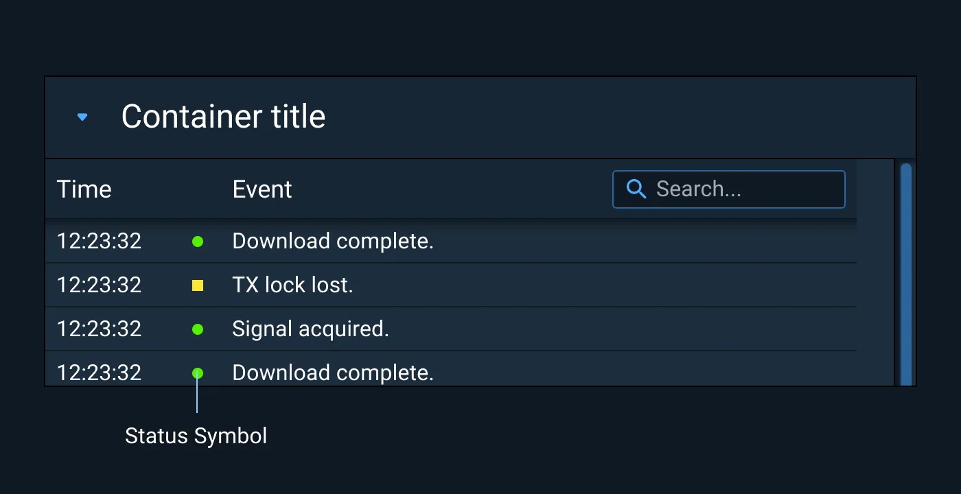
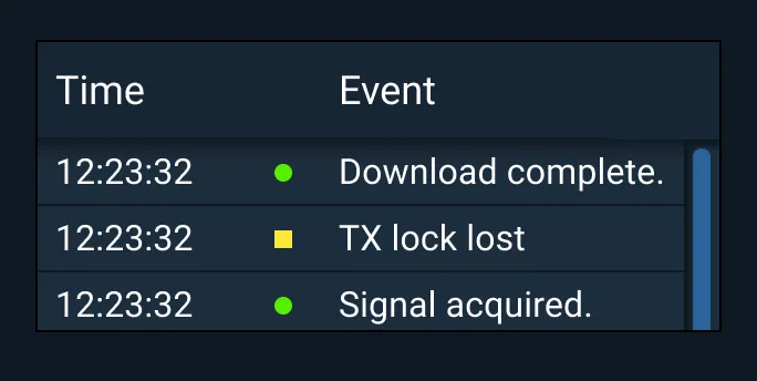
Log notifications are less urgent notification patterns as they do not disrupt a user’s workflow and are captured for later forensic use.
Log notifications can be purely informational, as in a satellite or application that is running normally, or they can be actionable, as with a satellite that may be experiencing an interruption in service which needs to be resolved (while this type of example may be logged, the appropriate pattern would be more disruptive, such as a banner, depending on the level of criticality of the system).
Examples
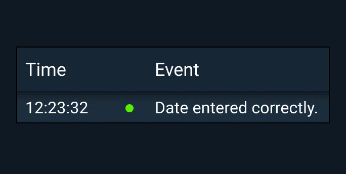
Badge
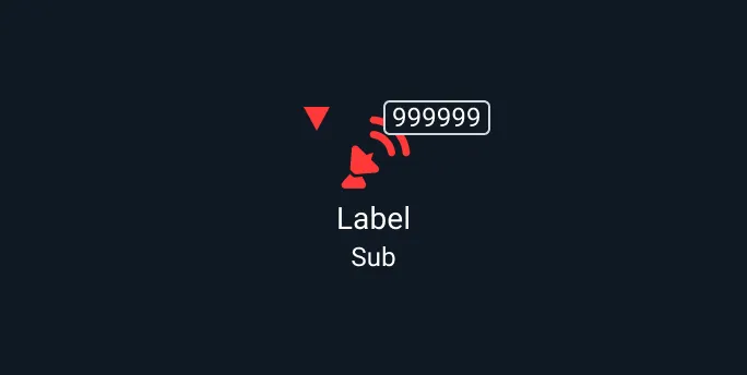
Events that require some user attention, but no immediate response, may be indicated by changes to a Badge.
This Badge shows that one event related to a satellite has occurred. You may hyperlink icons to reveal a deeper view of relevant Notification information. You may also link to the general log.

Examples
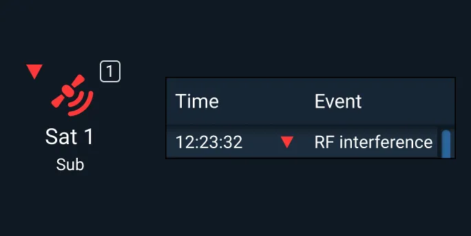
Toast
A communication that requires user attention but is not necessarily considered the most urgent would be a candidate for a toast notification.
Toasts are non-modal notifications that display a short message to the user. Toast notifications attract a user’s attention without forcing the user to interact with the message as they can dismiss on a timer.
Placement
Toasts typically slide in and out of the top right side of the desktop screen, and should be displayed below Badges if those are being used in the status bar. Toasts can also be displayed at the bottom end (left or right) or top center of the desktop screen.
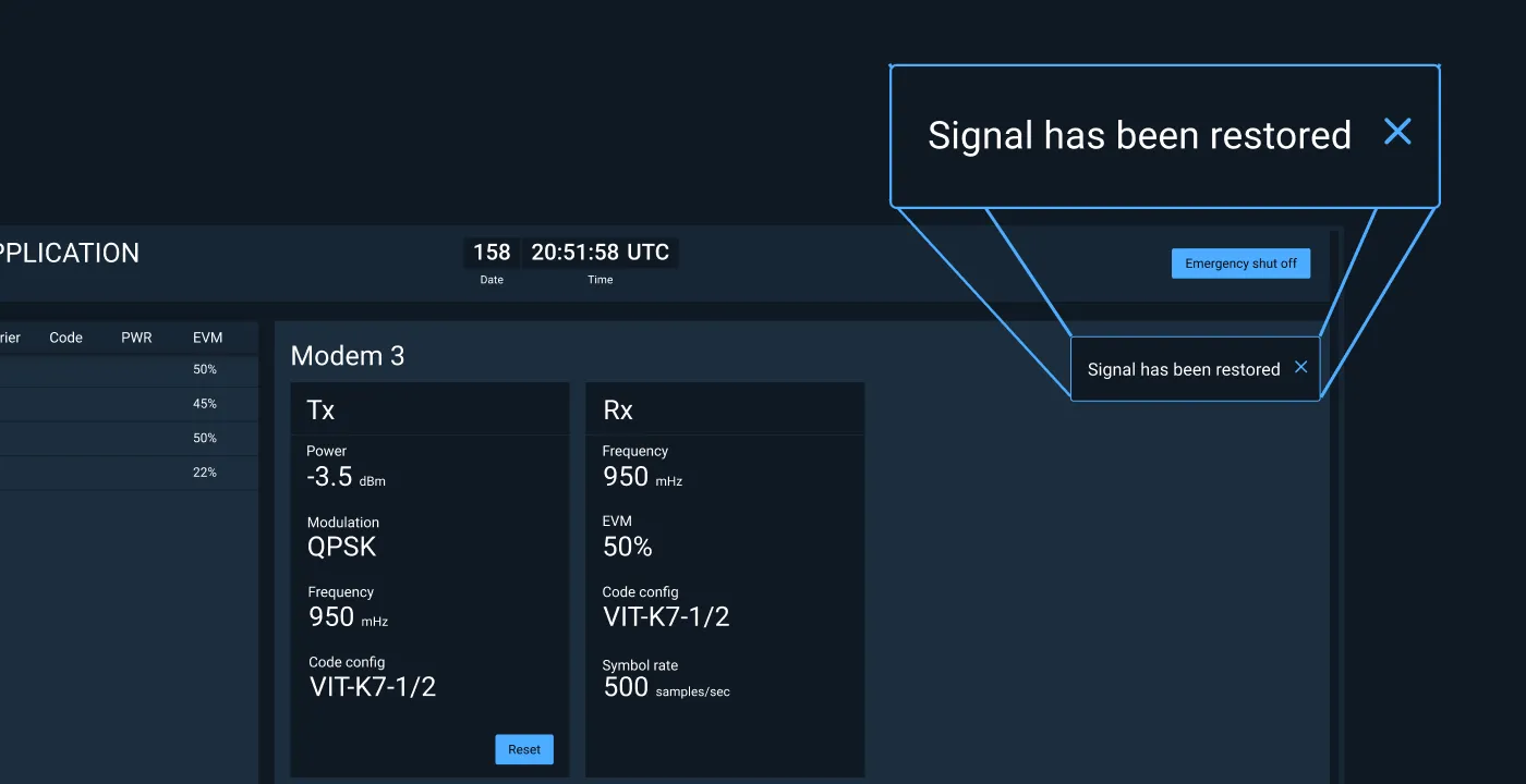
Dismissible Toast
A toast message with actionable content that will persist until it is dismissed by the user.
Examples
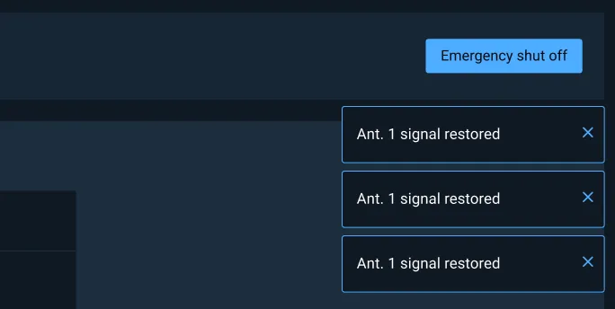
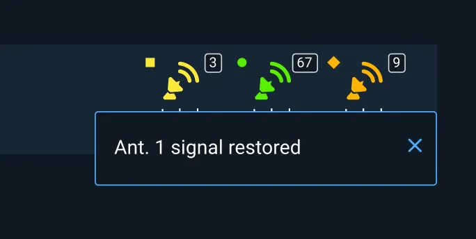
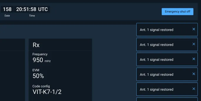
Banner
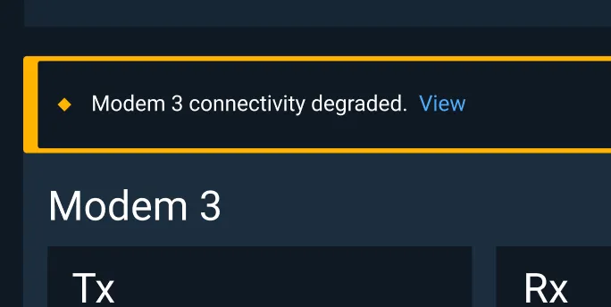
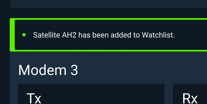
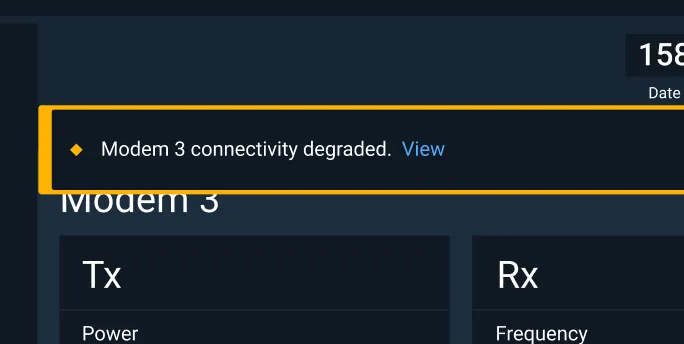
Events that provide urgent information but don’t require an immediate response may be displayed in a Notification Banner. The Banner displays within the user’s field-of-view, but doesn’t block other interaction. Banners can communicate system or product wide updates or changes, or be used to alert a user to an important change requiring user action. Banners have the ability to easily attract a user’s attention; consider whether this is the appropriate pattern for the message being communicated.
Placement
If the user is currently working in a specific screen area, the Banner may be presented in that area. If the Notification is more general, or doesn’t relate to a specific area of the screen, it may be presented in the center of the screen just below the Global Status Bar.
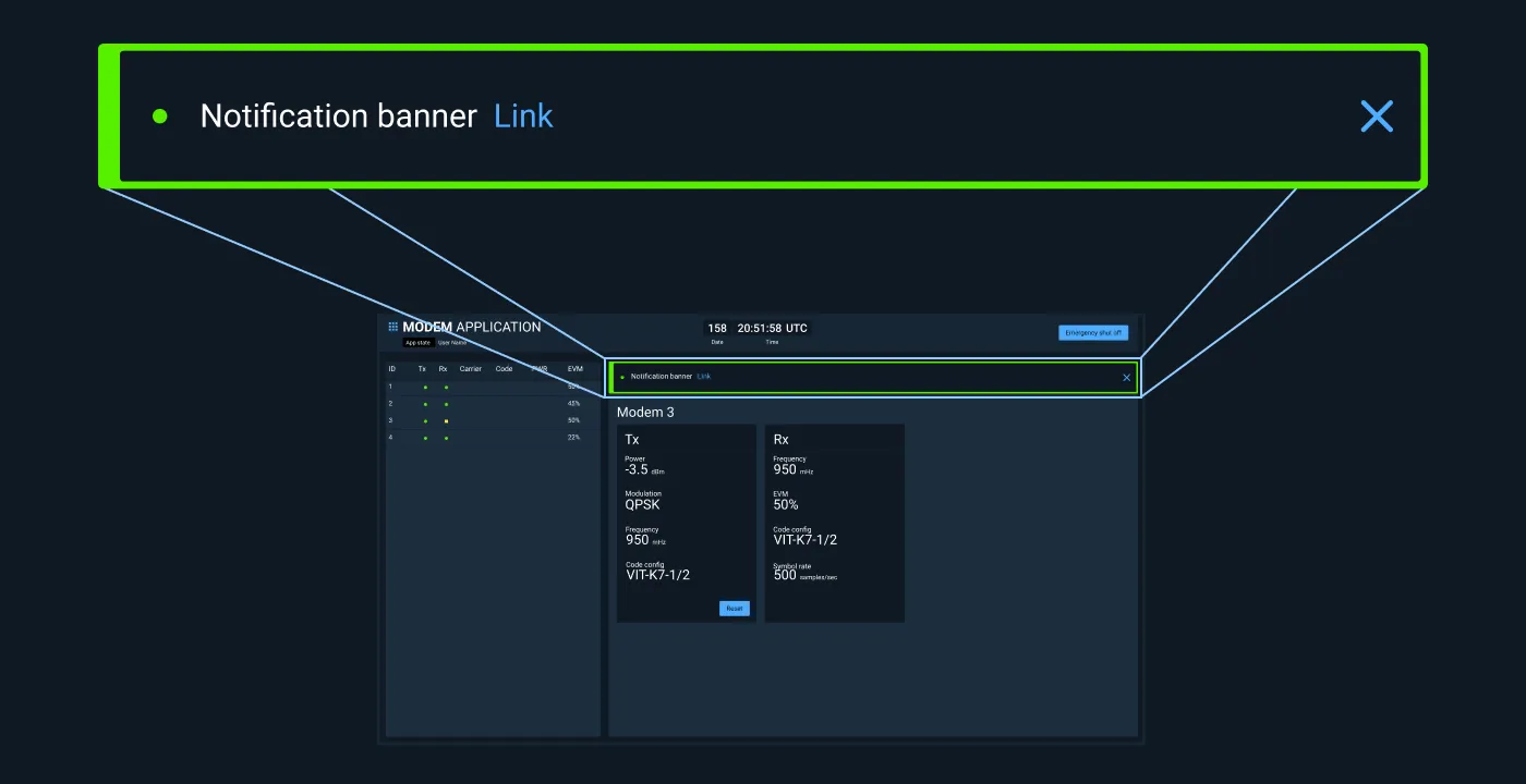
Examples
Modal Dialog
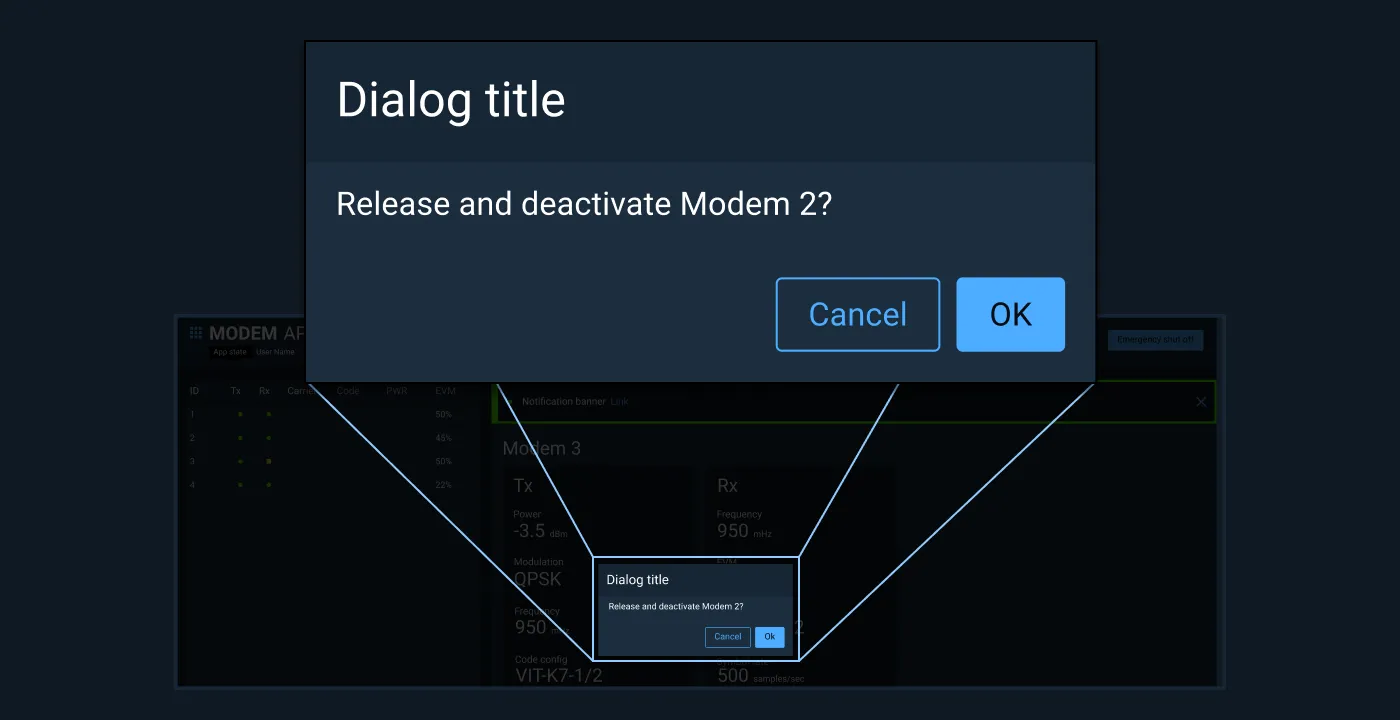
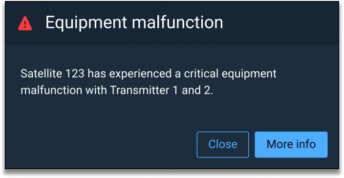
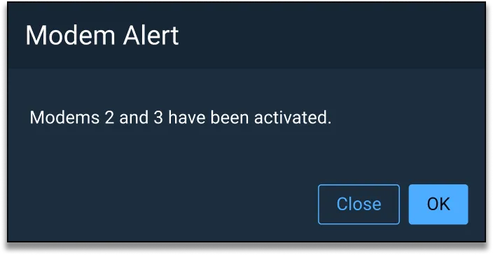
For events that require the user’s immediate attention and response, a modal Dialog may be used. Modal Dialogs should be avoided if possible, as they deliberately interrupt all other user interaction which could be critical.
Examples
Notification Status
Guidance for communicating status can be found on the Status System page on the Astro UXDS website.
Asset Status
| Asset | Version | Status |
|---|---|---|
| Documentation | N/A | Available |